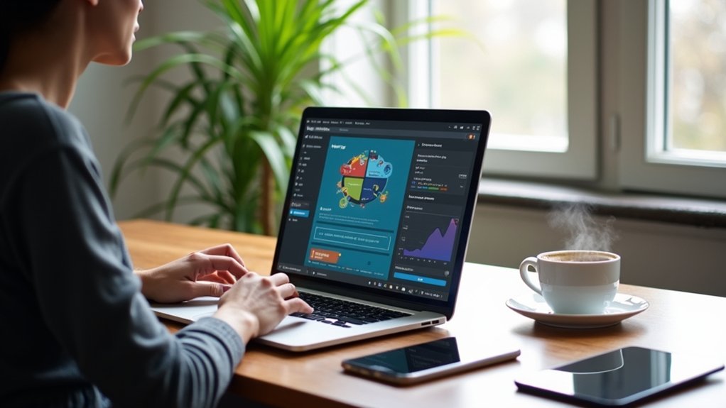
To fix mobile usability issues in WordPress and improve responsive design, site owners should first audit their site using Google Search Console’s Mobile Usability report and the Mobile-Friendly Test. Solutions include applying responsive themes, adding the meta viewport tag, using CSS media queries for font and layout scaling, increasing tap target spacing, and setting `max-width: 100%` for images. Plugins can enhance navigation and automate mobile adjustments. Further guidance covers advanced fixes and extensive validation steps.
Key Takeaways
- Use a responsive WordPress theme and add CSS media queries to ensure layouts adapt to all screen sizes.
- Set a minimum mobile font size of 16px and use relative units like ’em’ or ‘rem’ for scalable typography.
- Add proper spacing between clickable elements by adjusting CSS margin and padding for at least 48-pixel touch targets.
- Ensure all images and containers use `max-width: 100%` and set the correct viewport meta tag for proper scaling.
- Regularly test your site on real devices and Google’s Mobile-Friendly Test to identify and address mobile usability issues.
Understanding the Importance of Mobile Usability
Given that over half of global web traffic originates from mobile devices, optimizing for mobile usability in WordPress is a technical necessity rather than an optional enhancement.
A WordPress website lacking a mobile-friendly site architecture risks diminished mobile user experience, directly impacting user engagement, retention, and brand perception.
Search rankings are now heavily influenced by Google’s mobile-first indexing, making responsive design implementation critical for visibility.
Brands focusing on mobile usability leverage CSS media queries, flexible grid layouts, and adaptive image delivery for seamless device compatibility.
Efficient mobile optimization not only improves accessibility but also correlates with increased conversions and reduced bounce rates.
Consequently, prioritizing responsive design within a WordPress website infrastructure delivers measurable competitive and financial advantages, substantiating the importance of robust mobile usability practices.
Checking Your WordPress Site for Mobile Usability Issues
To systematically identify mobile usability issues in WordPress, webmasters should leverage Google Search Console’s Mobile Usability report for error diagnostics and prioritization.
Running Google’s Mobile-Friendly Test provides immediate, code-level insights into responsiveness problems and specific elements requiring adjustment.
These tools enable rapid detection and targeted remediation of mobile-specific barriers affecting user experience.
Using Google Search Console
Leverage Google Search Console (GSC) to systematically identify mobile usability issues affecting a WordPress site. After logging into GSC, navigate to the Mobile Usability report, which highlights URLs with specific errors that hinder ideal display on mobile devices.
This report pinpoints common issues such as text too small to read, clickable elements placed too closely together, and content that extends beyond the viewport, all of which compromise responsive design. By referencing the report, developers can implement targeted CSS or theme adjustments to fix mobile usability issues efficiently.
Once changes are deployed, utilize the “Validate Fix” option in GSC to prompt Google to re-crawl and confirm resolution. Regularly consulting this report is essential for maintaining seamless user experiences across mobile devices.
Running Mobile-Friendly Tests
After identifying mobile usability issues through Google Search Console, conducting direct mobile-friendly tests provides actionable insights into a WordPress site’s real-world performance.
Utilizing a mobile-friendly test tool is essential for verifying the effectiveness of a responsive theme and pinpointing code-level issues. To systematically test your website and track changes, follow this approach:
- Use Google’s Mobile-Friendly Test tool by submitting your site URL. Analyze the results for specific mobile usability errors such as viewport misconfiguration or touch element proximity.
- Test your website on multiple devices (Android, iOS) and browsers to guarantee consistent rendering and performance across varied environments.
- Utilize browser developer tools (e.g., Chrome DevTools) to simulate different device dimensions, enabling rapid iteration and validation of CSS media queries and responsive breakpoints.
Regular testing guarantees ongoing mobile optimization.
Using Google Search Console’s Mobile Usability Report
Google Search Console’s Mobile Usability Report enables site administrators to systematically access, review, and address mobile-specific errors identified on their WordPress platforms.
By interpreting the detailed diagnostics for each flagged issue, developers can prioritize code or CSS modifications as needed.
Once updates are deployed, the Validate Fix feature streamlines confirmation that the corrective measures resolve the reported problems.
Accessing the Usability Report
Once logged into Google Search Console, users can access the Mobile Usability Report by selecting the relevant property and steering to the “Mobile Usability” option in the left-hand menu.
This report is essential for pinpointing mobile usability issues affecting WordPress sites. The Mobile Usability Report provides a technical breakdown of flagged pages, identifying problems like clickable elements too close together and text size issues.
To efficiently leverage this tool, follow these steps:
- Navigate to Google Search Console, select the website property, and click “Mobile Usability.”
- Review the list of affected URLs and note the specific mobile usability issues, such as text size or touch target proximity.
- After fixing issues in WordPress, utilize “Validate Fix” in Google Search Console to trigger a reevaluation and confirm remediation.
Interpreting Reported Issues
A thorough understanding of the Mobile Usability Report in Google Search Console enables targeted troubleshooting of WordPress site issues. The mobile usability report systematically lists usability issues such as “text too small to read,” “clickable elements too close together,” and “content wider than screen.” Each issue includes affected URLs, facilitating efficient isolation and enhancement of problematic pages to achieve a fully responsive design. Monitoring the status and number of impacted pages helps prioritize fixes and track ongoing mobile optimization efforts. By utilizing these granular insights, developers can effectively address usability issues, ensuring an ideal mobile experience. The table below summarizes common issues and their implications:
| Issue Detected | Optimization Focus |
|---|---|
| Text too small to read | Adjust font-size via CSS |
| Clickable elements too close | Increase padding/margin |
| Content wider than screen | Update responsive breakpoints |
| Total affected pages | Prioritize high-traffic URLs |
Validating Implemented Fixes
Initiate the validation process by maneuvering to the Mobile Usability Report within Google Search Console to confirm the effectiveness of recent code adjustments on WordPress sites.
Validating implemented fixes is critical for ensuring that mobile usability issues are resolved and the responsive design is functioning as intended.
To leverage Google Search Console for this process:
- Access the Mobile Usability Report and review identified issues post-fix to locate any remaining errors.
- Select the “Validate Fix” button for each resolved mobile usability issue, prompting Google to re-crawl and re-assess the affected URLs for compliance.
- Monitor feedback from Google, recognizing that validation may take several days, and regularly review the report to catch any new issues.
Successful validation enhances user experience and positively influences search engine rankings.
Running Google’s Mobile-Friendly Test
Google’s Mobile-Friendly Test serves as a diagnostic utility for evaluating a WordPress site’s compliance with mobile usability standards. By entering a specific URL, developers gain immediate insights into critical mobile usability issues, such as improper viewport configuration, insufficient text size, or inadequate spacing of interactive elements.
The mobile-friendly test systematically assesses responsive design integrity and delivers actionable recommendations for remediation. For example, it may identify the need to optimize images for mobile, ensuring faster load times and enhanced user experience.
Real-time feedback aids in iterative site improvements, maintaining alignment with Google’s mobile usability benchmarks. Regular utilization of this tool enables site administrators to proactively detect and resolve issues, supporting ongoing responsive design optimization and boosting the overall performance and accessibility of the WordPress site.
Common Mobile Usability Issues in WordPress
Mobile usability challenges in WordPress often stem from misconfigured responsive design elements and suboptimal theme implementation.
Developers frequently encounter common mobile usability issues that degrade site performance and user experience. These issues typically include viewport not set, inconsistent font sizes, clickable elements too close together, content wider than the screen, and the presence of incompatible plugins.
- Viewport Not Set: Omitting the `` tag causes improper scaling on mobile devices, leading to distorted layouts.
- Font Sizes and Clickable Elements: Font sizes under 16px and clickable elements too close together impair readability and increase tap errors for users on touch devices.
- Content and Plugins: Content wider than the screen triggers horizontal scrolling, while incompatible plugins can introduce rendering or functionality errors on mobile browsers.
Fixing Text Too Small to Read
To resolve the issue of text appearing too small on mobile devices, developers should adjust mobile font sizes using CSS media queries and set a minimum font size of 16px.
Implementing responsive typography through relative units like ’em’ or ‘rem’ allows text to scale appropriately across varying viewport dimensions.
Reviewing and configuring font settings within page builders or custom themes guarantees ideal legibility for all users.
Adjusting Mobile Font Sizes
A common cause of mobile usability issues in WordPress is insufficient font size, which often renders text too small to read without zooming.
To enhance readability for mobile users, developers should prioritize setting minimum font sizes and leverage responsive design techniques. Precise adjustments using CSS media queries guarantee that font size scales appropriately across different devices, improving overall user experience.
Consider these technical steps:
1. Set a minimum font size of 16px in your WordPress theme’s CSS to guarantee baseline readability for mobile users.
2. Utilize CSS media queries to refine font size for various screen widths, such as:
“`css
“`
3. Employ relative units like “em” or “rem” instead of fixed pixels for better responsiveness and scalability.
Implementing Responsive Typography
How can developers guarantee text remains legible across varying device screens? Implementing responsive typography is essential for WordPress users aiming to deliver legible text on all screen sizes.
The solution begins with establishing a minimum base font size of 16px, preferably using scalable CSS units like `em` or `rem`. To further refine font size per device, developers should employ media queries, for example:
“`css
body { font-size: 1rem; }
}
“`
Additionally, utilizing viewport-relative units (`vw`) dynamically adjusts font size relative to the screen, enhancing responsive typography.
For sites built with Elementor or similar page builders, capitalizing on mobile breakpoint settings allows typography customization per device.
Continuous testing on real mobile devices guarantees ideal legibility, allowing adjustments as necessary for perfect user experience.
Resolving Clickable Elements Too Close Together
Many WordPress sites encounter mobile usability issues when clickable elements—such as buttons and links—are positioned too closely, often violating the recommended 48-pixel spacing for touch targets. This compromises mobile user experience by increasing the likelihood of accidental taps.
Closely placed buttons and links on WordPress sites often lead to poor mobile usability and accidental taps for users.
A technical approach to resolving this involves adjusting spacing and utilizing responsive design principles. Consider the following steps:
- Increase spacing between clickable elements by adding CSS `margin` or `padding` properties. Use media queries to target mobile breakpoints for precise control.
- Utilize responsive design features in WordPress plugins or page builders like Elementor, which provide mobile-specific controls to adjust spacing without manual code.
- Regularly test the site on multiple mobile devices, using browser developer tools or real devices, to identify and correct any remaining spacing issues between clickable elements.
Addressing Content Wider Than the Screen
When content exceeds the viewport width on mobile devices, users encounter horizontal scrolling and disrupted layout integrity, often resulting from images or elements lacking responsive constraints.
To resolve content wider than the screen, developers should apply the CSS rule `img { max-width: 100%; height: auto; }` to guarantee images scale within container boundaries.
Employ responsive design principles by integrating CSS media queries to dynamically adjust container widths, padding, and font sizes according to screen dimensions.
Implementing a fluid grid system further supports flexible layouts, preventing overflow.
Regularly audit the site with Google’s Mobile-Friendly Test to identify and troubleshoot mobile usability issues.
Addressing these factors systematically guarantees that all site components remain within the viewport, maintaining seamless usability across device sizes.
Setting the Viewport Meta Tag Correctly
Implementing the viewport meta tag is fundamental for controlling how a webpage scales and displays on mobile devices. Without this tag, even well-designed WordPress themes can exhibit display issues, such as improper scaling or content overflowing the screen.
The viewport meta tag is critical for achieving responsive design, as it instructs browsers to adapt the layout based on the device’s screen width. Most modern WordPress themes include this tag by default, but custom theme developers should guarantee its presence by adding `` to the header.
The viewport meta tag ensures responsive design by guiding browsers to fit layouts to any device’s screen width—essential for modern web development.
To optimize mobile usability:
- Verify the viewport meta tag exists in your theme’s head section.
- Use Google’s Mobile-Friendly Test to identify related display issues.
- Manually add or correct the viewport tag in custom themes if needed.
Identifying and Removing Incompatible Plugins
Audit the site’s plugin stack to mitigate mobile usability issues caused by incompatible or outdated extensions.
Incompatible plugins often introduce deprecated technologies or conflict with the latest WordPress core, undermining responsive design and degrading user experience on mobile devices.
Use a staging environment to systematically deactivate and test each plugin, isolating those responsible for layout errors or slow loading times.
Verify compatibility information and changelogs provided by developers, focusing on mobile usability and responsive design support.
After removing or replacing incompatible plugins, implement performance monitoring with tools like Google Search Console to confirm resolution of mobile usability issues.
This code-focused, iterative process guarantees that only compatible, up-to-date plugins remain, safeguarding WordPress site performance and assuring a seamless mobile user experience.
Optimizing Images and Media for Mobile Devices
Optimizing images and media for mobile devices requires selecting responsive image sizes using the srcset and sizes attributes in HTML to deliver appropriately scaled assets.
Compressing media files through automated tools or plugins minimizes bandwidth usage while maintaining visual fidelity.
Implementing adaptive image delivery via next-gen formats like WebP and CSS max-width: 100% guarantees efficient rendering and seamless display on diverse mobile screens.
Choosing Responsive Image Sizes
How can developers guarantee that images and media render efficiently across diverse mobile devices? Selecting appropriate responsive image sizes is essential for ideal loading times and adherence to mobile usability standards.
Utilizing a technical approach, developers should:
- Leverage the `srcset` attribute within the `
` tag to serve distinct responsive image sizes based on device resolution, ensuring images remain crisp without excessive bandwidth consumption.
- Apply the CSS property `max-width: 100%;` to all images, enabling them to scale responsively within their containers and preventing layout overflow on smaller screens.
- Integrate responsive design frameworks like Bootstrap, which automate image and layout adaptation for varying viewport dimensions, streamlining cross-device consistency.
Consistent testing with tools such as Google PageSpeed Insights validates image optimization and confirms compliance with mobile usability standards, supporting an efficient, responsive design.
Compressing Media for Speed
Effective mobile performance depends on rigorous media compression strategies to minimize bandwidth usage and accelerate page loads.
Compressing images with tools such as TinyPNG or ShortPixel reduces file sizes by 50-80%, directly enhancing mobile loading speeds without perceptible loss in visual fidelity.
Conversion to the WebP format further decreases image payload by up to 34% compared to JPEG or PNG.
Utilizing lazy loading guarantees images are only fetched as they enter the user’s viewport, reducing initial HTTP requests and conserving mobile data.
Regular audits to resize images for the maximum viewport width prevent horizontal scrolling and streamline user experience.
Integrating a content delivery network (CDN) distributes optimized media globally, guaranteeing rapid asset retrieval and minimizing latency for mobile users across different regions.
Implementing Adaptive Image Delivery
Leverage adaptive image delivery by integrating responsive image techniques such as the HTML `srcset` attribute, which instructs browsers to select the best image size based on device resolution and viewport.
This approach dramatically enhances mobile optimization by delivering images tailored to each device, reducing bandwidth usage and improving performance. Unoptimized images can slow down load times by up to 70%, so optimizing image delivery is essential for user retention and search ranking.
- Use responsive images with `srcset` and `sizes` to serve different resolutions, minimizing unnecessary downloads on mobile devices.
- Convert assets to modern formats like WebP; this reduces file sizes by 25-34% without quality loss, further boosting mobile optimization.
- Implement lazy loading images via the `loading=”lazy”` attribute or JavaScript, ensuring images load only when visible in the viewport.
Implementing Responsive Design in WordPress
To guarantee ideal user experience across devices, implementing responsive design in WordPress requires the use of themes engineered to adapt layouts dynamically to varying screen sizes.
Technically, this is achieved by integrating CSS media queries, which allow developers to specify distinct styles for different viewport widths, ensuring excellent readability and mobile usability.
Utilizing WordPress plugins such as WPtouch or AMP for WP further streamlines the process, providing automated solutions for mobile optimization and faster load times.
Image optimization is essential—developers should apply the CSS max-width property to images, ensuring scalable visuals that prevent horizontal scrolling on smaller screens.
It is critical to regularly test website performance on devices like smartphones and tablets to promptly identify and resolve any responsive design inconsistencies introduced by theme updates or content changes.
Streamlining mobile navigation in WordPress involves deploying adaptive menu structures, such as hamburger menus, that minimize on-screen clutter and facilitate rapid access to key site sections.
Improving navigation for mobile users requires the integration of responsive design techniques and strategic plugin selection to enhance user experience. Developers should focus on touch-optimized elements and efficient menu hierarchies that adapt seamlessly across device breakpoints.
Key implementation steps include:
- Limit navigation to 5-7 essential menu items to maintain clarity and reduce cognitive load on small screens.
- Utilize WordPress plugins like WP Mobile Menu to deploy customizable, responsive hamburger menu solutions with minimal coding.
- Leverage analytics and user feedback to iteratively refine navigation, ensuring persistent enhancement for mobile users and improved usability.
These strategies collectively enhance navigation, supporting peak user experience.
Testing Your Fixes on Multiple Devices
Thorough validation is essential to confirm that recent mobile usability fixes function consistently across diverse devices and operating systems. Testing your fixes on multiple devices is a critical step in ensuring robust responsive design.
Developers should leverage both emulators—such as Browser Dev Tools for device simulation—and real device testing on various smartphones and tablets. This approach helps uncover edge-case issues that may not surface in virtual environments.
Compatibility testing should encompass major browsers and platforms, addressing any discrepancies in rendering or interactivity. Regular monitoring of Core Web Metrics, including metrics like Largest Contentful Paint (LCP) and First Input Delay (FID), is crucial for optimizing user experience.
Additionally, Google’s mobile-friendly test can quickly identify persistent usability concerns, further refining site performance for mobile audiences.
Validating Mobile Usability Fixes With Google
Leverage Google Search Console’s Mobile Usability Report to systematically confirm that recent WordPress fixes address documented mobile errors.
Validating mobile usability fixes requires a methodical approach to guarantee compliance with mobile usability standards and best user experience. After deploying changes, developers should utilize the Mobile Usability Report to identify which issues have been resolved and which persist.
The process involves:
- Accessing the Mobile Usability Report in Google Search Console and pinpointing specific errors.
- Clicking the affected issue and selecting “Validate Fix” to prompt Google to reassess the impacted pages and confirm if the fixes resolve errors.
- Monitoring the report regularly for Google’s feedback and any new usability issues, as the validation process may take time.
Continuous validation is essential for maintaining high mobile usability and search performance.
Frequently Asked Questions
How to Fix Mobile Responsive in Wordpress?
To fix mobile responsive issues in WordPress, one should select mobile themes, leverage responsive plugins, configure proper viewport settings, apply CSS adjustments, implement image optimization techniques, and utilize testing tools to guarantee consistent functionality and appearance across devices.
Why Does My Wordpress Site Not Look Good on Mobile?
A WordPress site may display poorly on mobile due to theme compatibility issues, improper mobile layout handling, insufficient content scaling for varying screen sizes, and browser differences, all negatively impacting user experience and necessitating responsive CSS and viewport configuration adjustments.
How to Optimize Wordpress for Mobile?
Mobile optimization techniques for WordPress include applying responsive design principles, utilizing mobile plugin recommendations, and optimizing user experience factors. Prioritize site speed considerations with image compression, implement CSS media queries, and utilize testing tools overview like Google Mobile-Friendly Test for validation.
How to Make Sure Your Wordpress Site Is Mobile Friendly?
Ensuring a WordPress site is mobile friendly requires selecting responsive themes for design fluidity, configuring viewport settings via `` tags, applying touch optimization for UI elements, conducting mobile testing, and monitoring performance metrics for continuous improvement.
Conclusion
Addressing mobile usability issues in WordPress requires a systematic approach: leverage Google Search Console and Mobile-Friendly Test for diagnostics, implement responsive design via CSS media queries and flexible layouts, and enhance navigation with mobile menus or plugins. Rigorous cross-device testing guarantees consistency, while validation through Google’s tools confirms compliance. By iterating through detection, code-level adjustments, and validation, developers can guarantee robust mobile usability, enhance user experience, and support peak site performance across all devices.